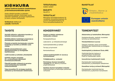

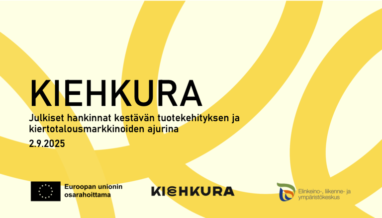
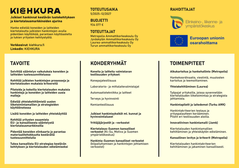
KIEHKURA project promotes the circular economy of machinery and equipment through public procurement by extending product lifespans, improving utilization rates, and supporting business development.
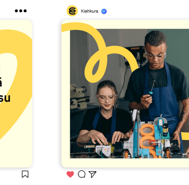
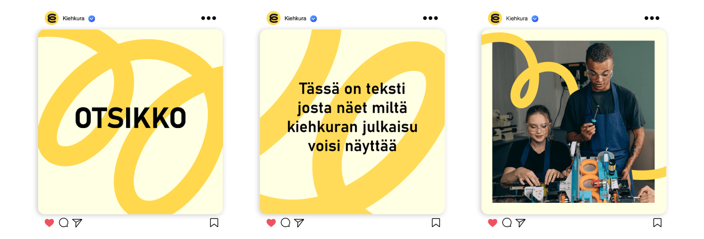
The Idea for the logo was to transform the letter “E” into a spring-like detail that could also work as a standalone icon, for example, on social media. I aimed for a clean and minimalistic design to ensure the logo would work seamlessly with various visual elements such as backgrounds and social media posts. Bright yellow was chosen as the main color to draw attention and convey a sense of energy and positivity.
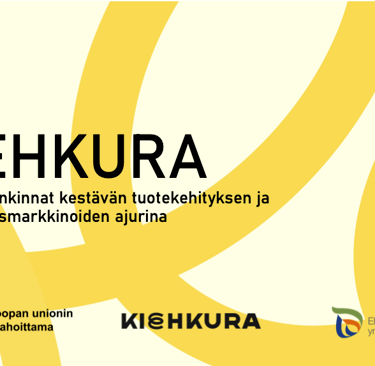
KIEHKURA
VISUAL BRANDING

KIEHKURA


KIEHKURA project promotes the circular economy of machinery and equipment through public procurement by extending product lifespans, improving utilization rates, and supporting business development.
The Idea for the logo was to transform the letter “E” into a spring-like detail that could also work as a standalone icon, for example, on social media. I aimed for a clean and minimalistic design to ensure the logo would work seamlessly with various visual elements such as backgrounds and social media posts. Bright yellow was chosen as the main color to draw attention and convey a sense of energy and positivity.